Friday, April 10, 2015

Freestyle Florals

FreestyleFlorals_Pair

These beauties were inspired by Laura Bassen's creation for the Mama Elephant release of Freestyle Florals.
I simply stamped an A4 sheet full of all the different images (flowers and leaves), coloured them very loosely with the Kuretake Gansai watercolours and then sat down in front of Comic Relief does Bake Off and cut them all out. Yes, by hand! With a pair of scissors! I’m slipping…
FreestyleFlorals_Birthday
The birthday sentiment is from the Winnie & Walter set  - again hand cut! – and selectively glued to make it stand out.
FreestyleFlorals_Mothers
The “mother’s” was designed on and cut out by the Cricut (I say designed, it looks like Lucida Handwriting from here!) and I think the other words are from the Big & Bold set too.
Pretty huh? And even I can’t kill these kind of flowers!

Wednesday, April 08, 2015

Long Landscapes

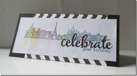
I might upset some people here but I am not really a fan of Tim Holtz Stamps. Distress Inks, I love and other Ranger products have made their way into my collection but I don't really like his blueprint sets and the crazier, creepier things he releases would just not go down well with my audience, regardless of my own opinion. Until his recent release of the Cityscapes stamps, that is.

I loved them the minute I saw them (except I can’t actually remember where that was) and knew I would have to wait a few weeks until they were available in the UK so I put them to the back of my mind until I saw this Cheiron Brandon card on Pinterest. I just had to seek them out. I found them on Artists Trading Post (and treated myself to a bottle of Cracked Pistachio Distress Ink while I was there too…really must open that!) and tried to recreate the card:

Paris Celebrate

It was crazy easy and I’m really pleased with it too. The sentiment is from a Winnie & Walter set called The Big, The Bold & The Party which was another one I saw on an American website and paced myself til it was available over here (although Tara at Make The Day Special is really good at getting these things quickly!) and its heat embossed in Black/Rainbow Glitter that I’ve had for forever:

Paris Celebrate CU

So while I was on a roll (around the world?) I tried New York too:

New York

They are stamped in Stazon onto Crawford & Black watercolour paper and the colour was added with the Kuretake Gansai watercolour paints. So just Rome, Sydney & London to go. Better get my bags packed…

Monday, April 06, 2015

Experiments In Time & Space

Anybody that knows me in real life knows I have trouble getting out of bed in the morning and one unremarkable morning, I was lying in bed daydreaming about the cards I could make that day when this idea leapt into my head: why not use my WOW! Melt It Powder in the Doctor Who themed chocolate moulds we bought a while back from Lakeland and try and make a little TARDIS to stick to a card?

Well, I spent a fair bit of time experimenting to get the effect I wanted, reminding myself how the melt it powder worked and trying to add colour to it -  I ended up adding drops of distress ink into the molten powder and I had to experiment with how much to add as it immediately congealed. At one point I was really wishing for a Bunsen burner or at the very least a tripod like we used to have at school to stand the heat tool in! I improvised with a jar:

IMAG1132

I originally wanted to make two and stick them back to back but it was difficult to get them smooth enough and even when I did manage to get a pair together, it was way too large for a single embellishment so I kept to one and worked to make the back as flat as possible.

I had also considered adding it to the card via string to enable it to be “flying” through time and space but this proved too difficult so I made an aperture in the card, sandwiched sequins and stars between two pieces of acetate and glue dotted the TARDIS at a jaunty angle!

IMG_0471

The next morning, I got to my desk and it had fallen off… so I stuck it down with glue gun glue this time! I inked up a panel for the front and am still trying to decide what sentiment to use so here it is in its almost finished glory:

IMG_0465

IMG_0468

If anyone wants to chime in with an appropriate sentiment, feel free…

Friday, April 03, 2015

An Orange Coloured Day

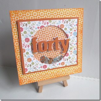
Forty Orange

Shaker cards are all the rage, huh? Well they were just starting almost twelve months ago when I made this card! I’d read a blog post by the esteemed Aimes Gray (of course then she was still a Wanford) which suggested funky foam as a filler for shaker cards, instead of using tons of foam squares – genius, right? She was the first person I saw using it but of course its become de rigeur since then!

These papers are from the huge pile of 6x6 paper I seem to have collected, I’m fairly sure the flowers are My Minds Eye but I don’t know about the orange.. what I do know is that after trying just about every piece of paper behind the window I decided I needed the same pattern as the outside but I didn't have enough left *gasp* …so I scanned the small scrap I hadn't stuck down on to my computer, duplicated it ‘til it was big enough and printed it out myself! Resourceful, huh?

I made another card just like this a week later for a guy turning forty – but I cant find the photos… it was blue, I seem to remember…

Thanks For Looking

Thursday, April 02, 2015

Home Comforts

IMG_0245 This is a bit of an odd one, I admit…
Much to the disappointment of my customers (i.e. my mom and my work colleagues), I don’t like just sticking “Happy Birthday” on the front of each of my cards. Sometimes (in a totally non-pretentious way) they are a little work of art that needs…something else. I had seen a stencil of the US used on somebody’s blog (if I remember who I will come back add it in) and was gripped with the great idea to make one of the United Kingdom. So I did!

Robo Cop cut it from some stiff paper and then I sponged Distress Inks through it, added a little water for the inks to do their thang and when it was dry, I ran it through my printer (sometimes a perilous idea) to add the Jane Austen quote which seemed so fitting. I find watercolour paper difficult to cut, I never get a clean edge with my trimmer, often it tears, if anyone can give me any advice…?

Sunday, March 29, 2015

Calm & Bright

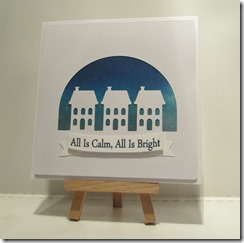
Here are some more from the commission back in December. Hope this isn't freaking you out but its less than nine months to go, I should probably start my shopping…

IMG_0424 IMG_0423
IMG_0422

IMG_0432

Again the Marianne dies have a connection to this, as the original card was a partial die cutting technique I’d tried with the Christmas Village but to make life easier for mass production, I recreated it in the Cricut Design Space. The banners were pretty fiddly and I trashed quite a few in the process but I got there in the end. All the sentiments are computer generated.

Thanks for looking!

Sunday, February 01, 2015

Season Of Colour

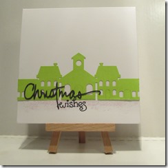
I realised, after reading a post by Jocelyn Olson, that I’ve hardly blogged about any of my Christmas cards. A very generous lady at work commissioned a whole load of cards from me, so I thought I would start with those:

IMG_0431 IMG_0430
IMG_0428 IMG_0427

The die cuts are a mixture of Marianne’s Christmas village and some I created myself in Cricut Design Space. The ‘happy’ is from Simon Says Stamp, I lopped the ‘s’ from the Cheers in the Paper Smooches birthday words die set and the ‘Christmas’ is a WInnie & Walter cut file.

I was pretty darn pleased with the end result!